HATS: A Design Procedure for Routine Business Documents
Overview
One of the most common mistaken notions novice professional writers hold is the idea that readers will approach their writing chronologically, reading the entire document from beginning to end.
In professional arenas, audiences are comprised of different readers, different needs, and different approaches to reading. Upper management may read documents for conclusions and recommendations, accountants may read documents for the budget sections, and lawyers may read documents for the backgrounds and methods. Because professional contexts have various audiences with various needs and interests, professional writers must create documents that are easy to navigate, easy to understand, and serve the needs of all potential audiences. These documents are sometimes known as “modular documents.”
Professional writers can use "HATS" to create modular documents that are easy to navigate, access, and understand. While we’re familiar with making documents rhetorically effective, HATS is a set of considerations for making documents visually effective.
Headings
Headings are navigation signposts that guide readers through documents and preview forthcoming information. Headings should be ADEQUATE in number/frequency to serve as landmarks of current and forthcoming content. Headings should be organized HIERARCHICALLY, using typeface, size, style, and alignment to show different levels of importance, specificity, and relationships.
For additional explanations and examples, check out the following links
- “Hierarchical Headings” from Typography for Lawyers; provides a great explanation of why writers should use a tiered number system instead of traditional Roman numerals or numbered/lettered hierarchies.
- “Lesson 6: Using Parallel Form” from Professional Writing Style by Dr. Russel Hirst, Associate Professor and Director of the Technical Communication Program at the University of Tennessee, Knoxville.
- “Managing Headings in Print and Online Documents” from David K. Farkas from the Department of Technical Communication in the
College of Engineering at University of Washington.
Access
When appropriate, visuals should accompany text to help convey complex ideas or data. This helps to make information understandable and accessible to audiences.
In professional documents, writers may decide to use lists, graphic organizers, tables, visual aids, charts, illustrations, or photographs to convey information that might be difficult to read, understand, or use in paragraph format.
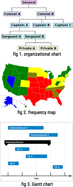
| Graphic | Information Type & Uses |
| tables | organized or systematic display of data |
| maps | geographic information; data by location |
| bulleted lists | unordered or nonchronological information |
| numbered list | ordered, prioritized, or chronological information |
| pie chart | relationships between parts and the whole. |
| bar graph | simple comparisons; changes in quantity |
| line graph | trends or changes over time |
| flowchart | a process, often with shapes to represent (types of) activities |
| organization chart | organizational hierarchy; how an organization is set up |
| Gantt chart | project schedule with concurrant, overlapping, and linear phases |
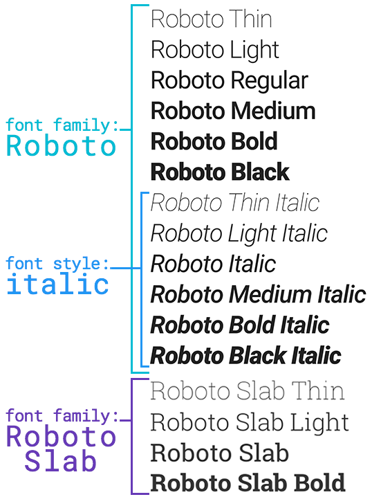
Typography
Type
Typeface can convey professionalism, illustrate contrast, and show hierarchical organization of information. In general, make sure body text is readable by using a 10-12 point common serif font such as Times New Roman (for print documents). Select a contrasting font for headings and vary type size and style for subheadings.
Avoid using more than two typefaces in routine business documents. Use size, style, and font variants (such as all caps, small caps, etc.) to indicate hierarchy and contrast. Above all else, make sure the text is readable.
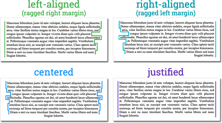
Alignment
Except in rare circumstances, left-align (or left-justify) your body text. Left-aligned text should leave a "ragged" right margin.
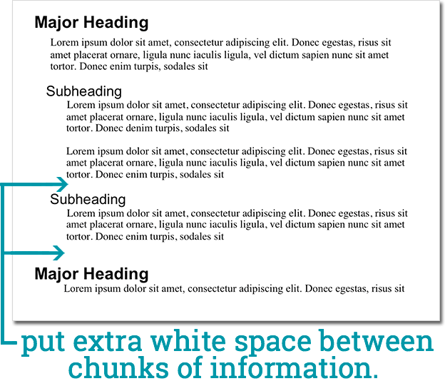
Space
Allow adequate marginal space around the document — for routine business documents, 1 inch on all sides. Additionally, use white space around visuals instead of lines or frames and use space to visually link headings and text.
Summary
To recap, ask these questions when using HATS:*
- Headings: Are there enough headings? Do they reflect a clear hierarchy of organization?
- Access: Is important information easy to find? Is the information easy to understand? Does the method of presentation enhance readability and clarity?
- Typography: Does the document use appropriate typefaces, size, styles, and alignment for both body text and headings?
- Space: Does the document have appropriate white space to make it inviting and easy to read?
A Final Note: